


Librăria de Design
Expressive illustration with a point of view.
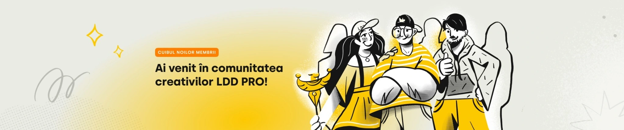
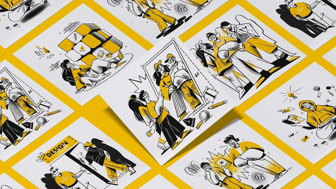
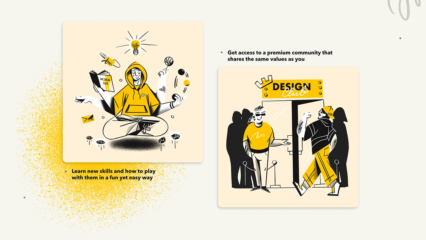
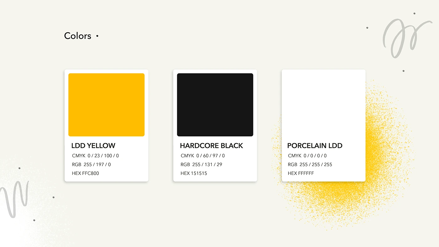
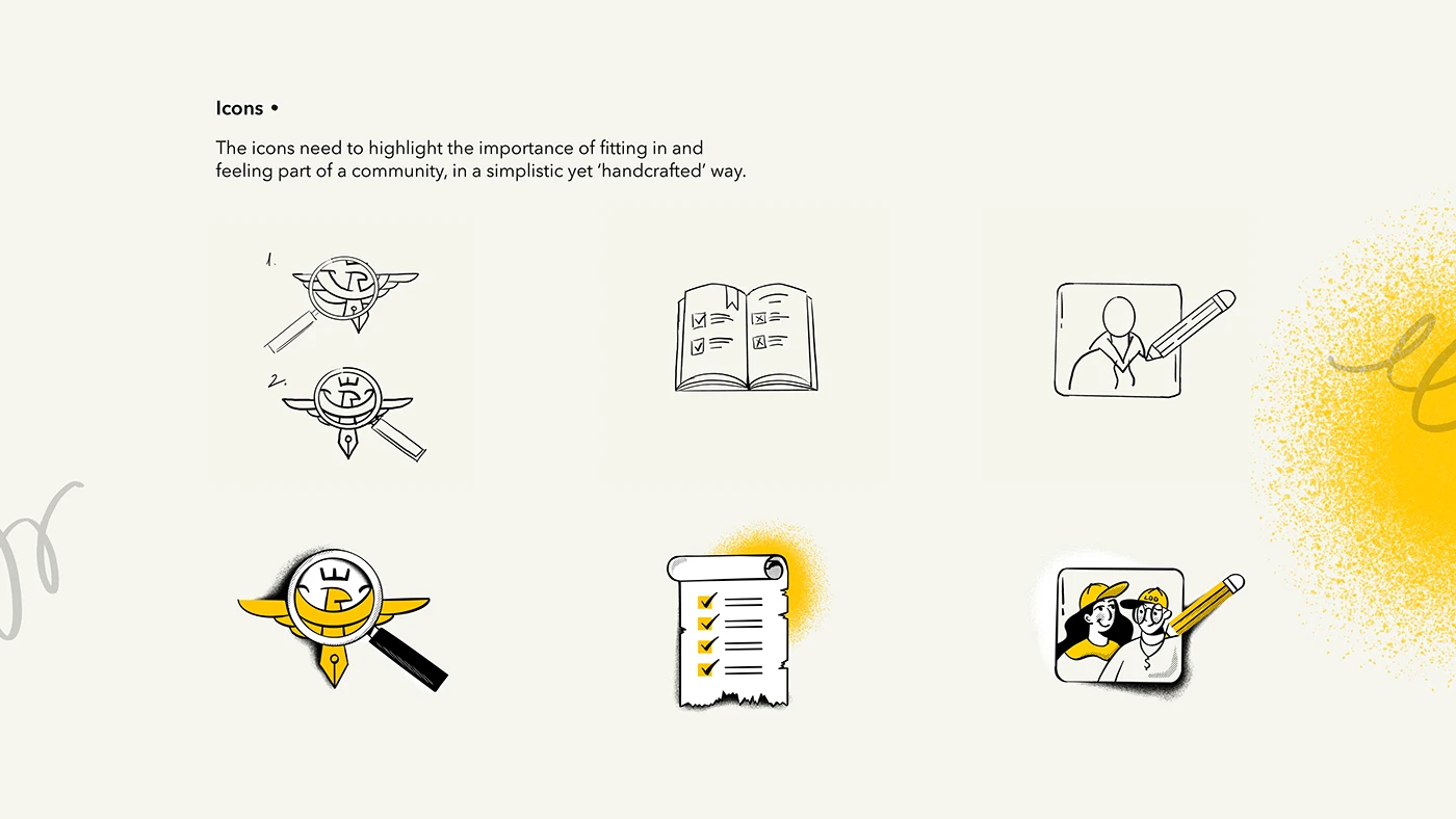
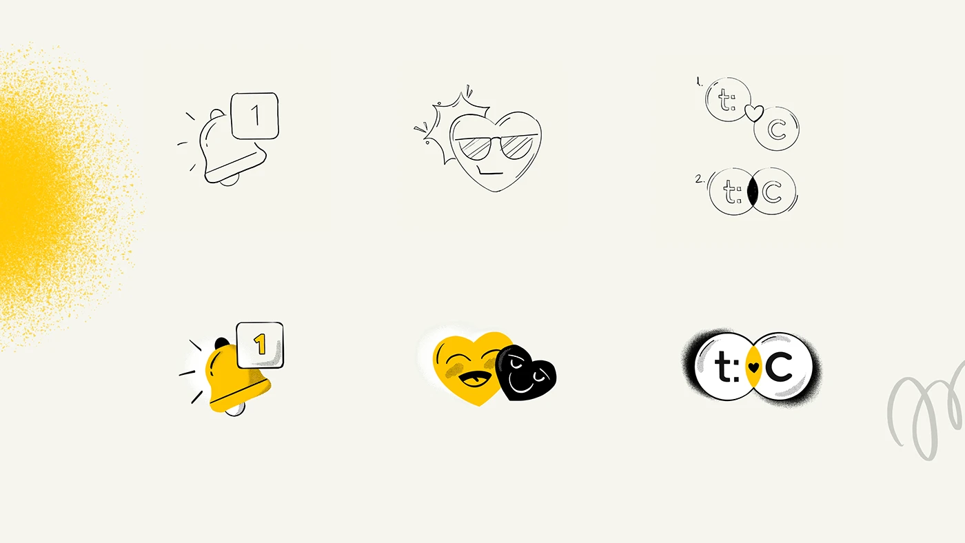
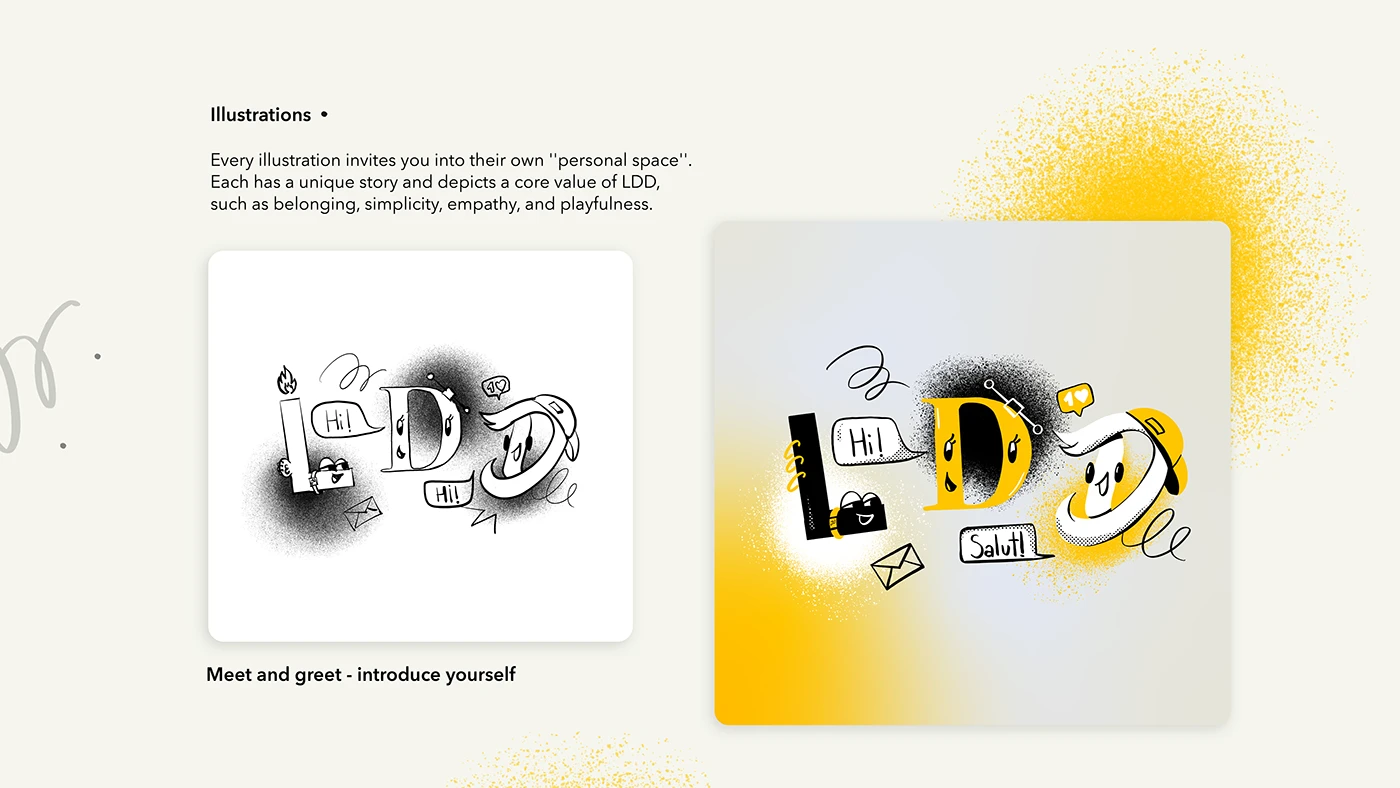
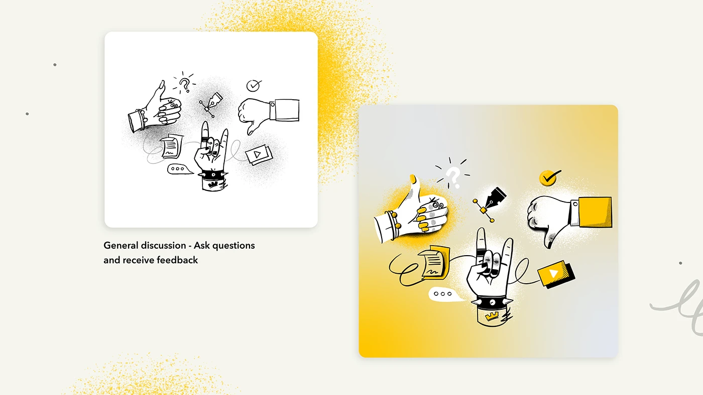
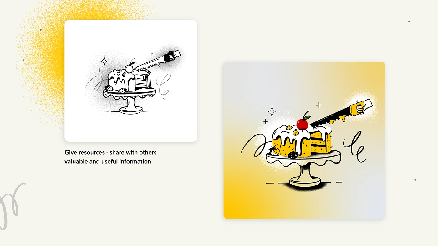
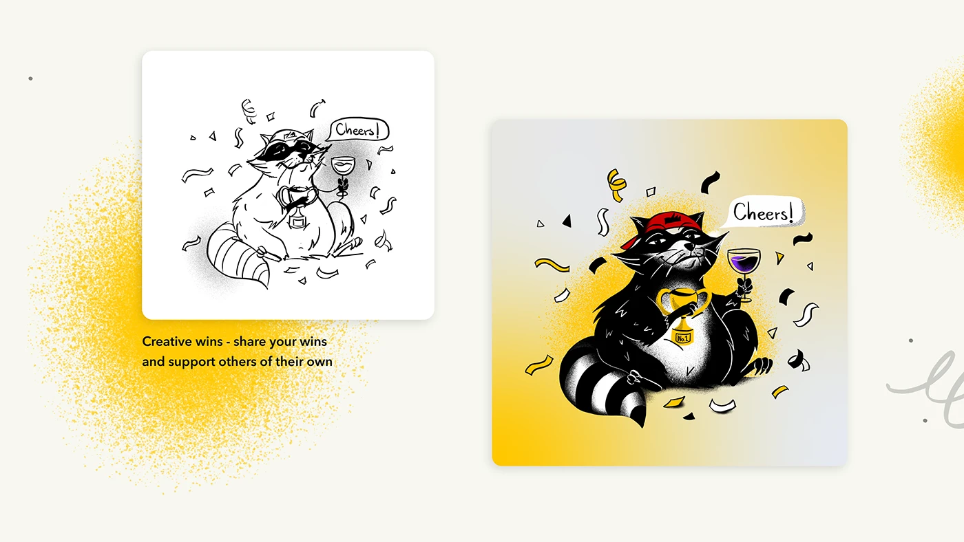
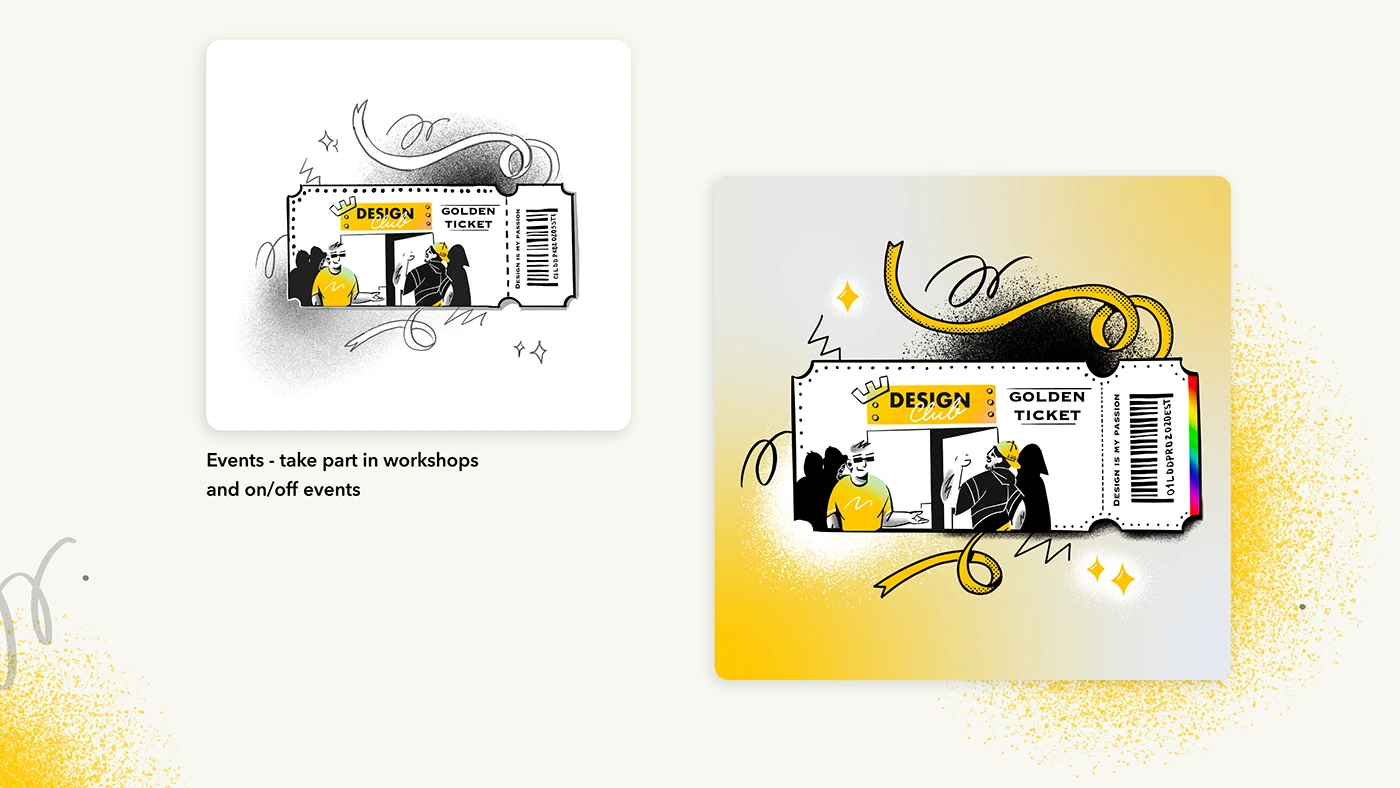
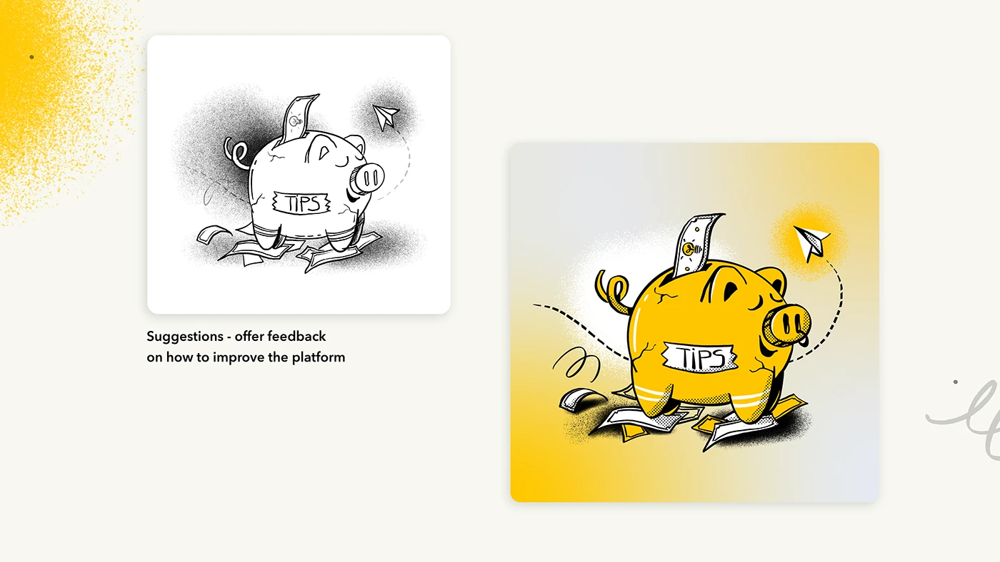
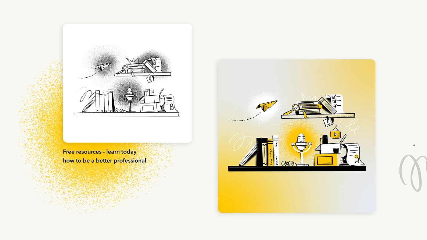
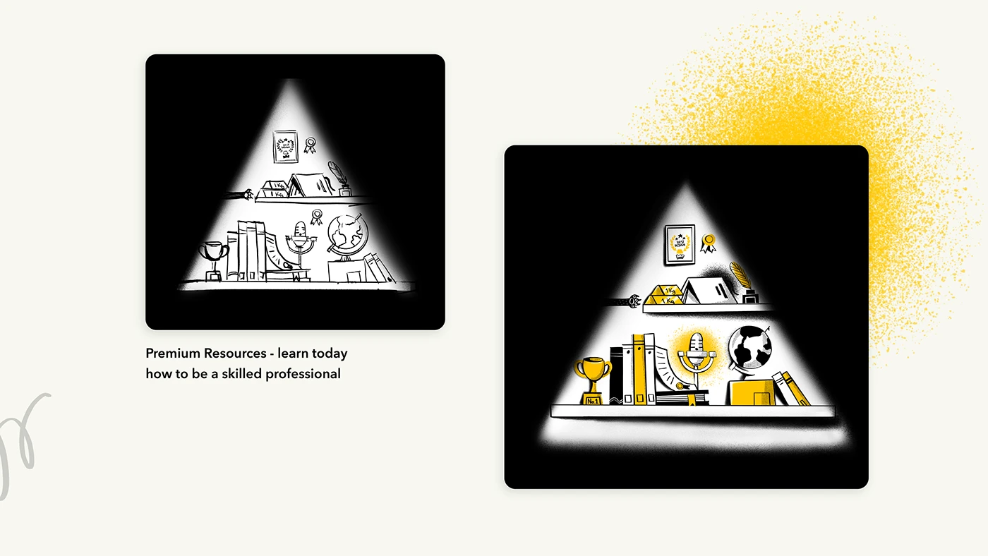
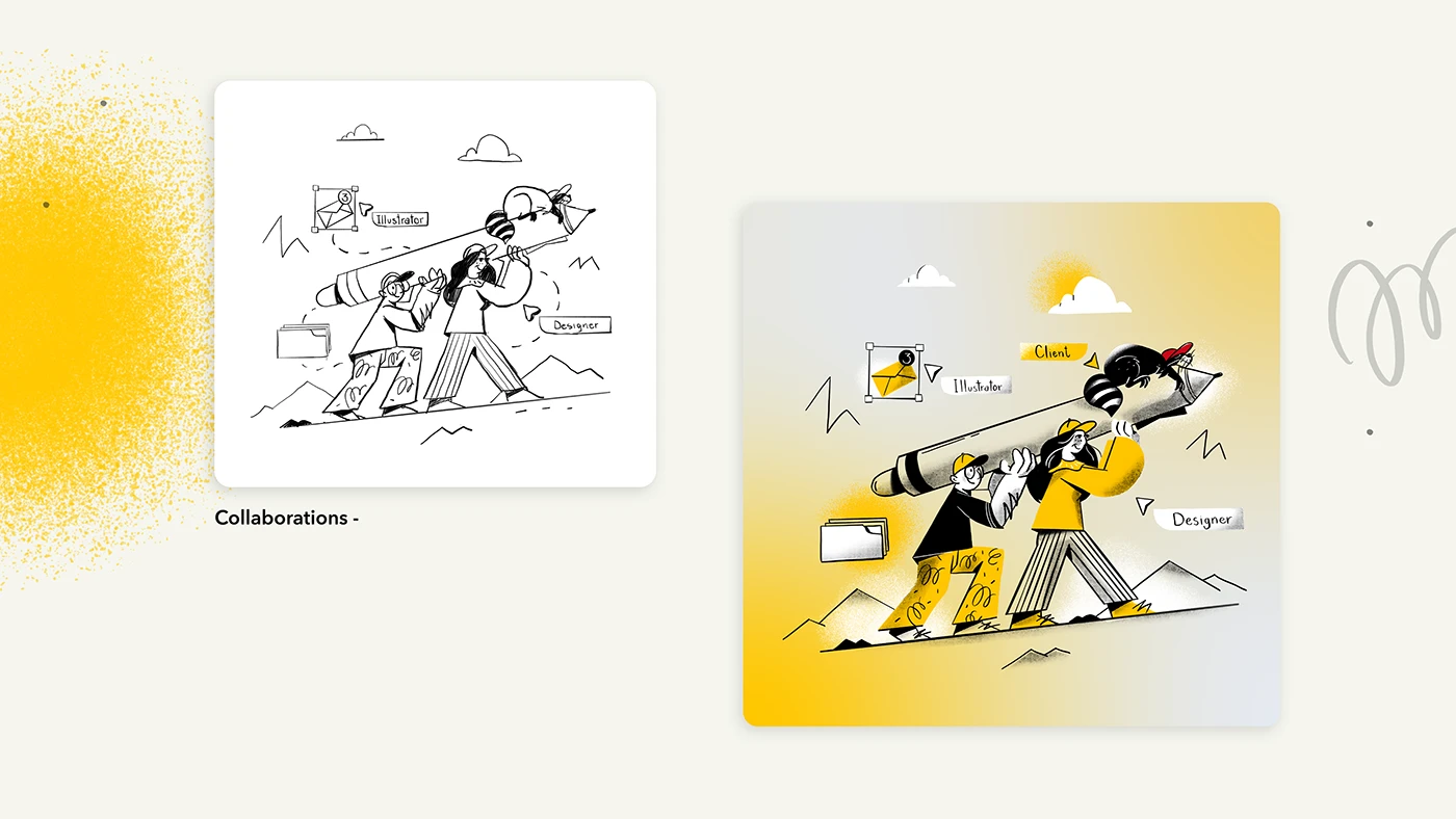
An illustration project for Librăria de Design, bringing together expressive characters, graphic shapes and a distinctive yellow, black and white palette.
The opportunity
Illustration creates room for personality: a gesture, a character or an unexpected composition can make an idea feel human. For a design-focused brand, that visual voice is part of the story.
What we did
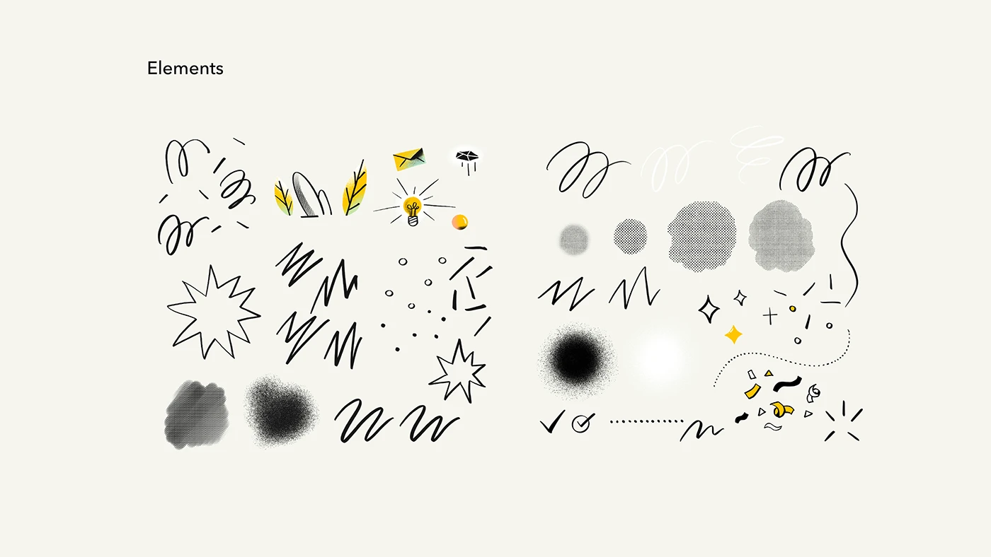
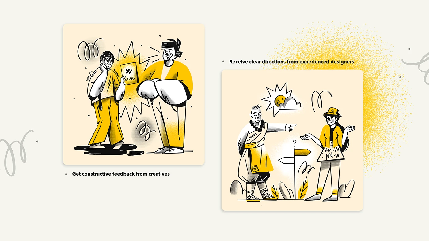
A character-led visual language, built around expressive linework, bold silhouettes and contrasting shapes. Yellow creates a consistent thread across the compositions, while black and white keep the illustrations crisp and graphic.
The images balance playful detail with a clear, recognisable point of view.
The outcome
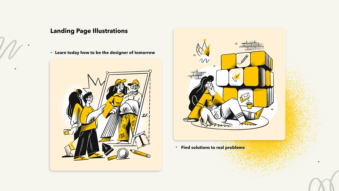
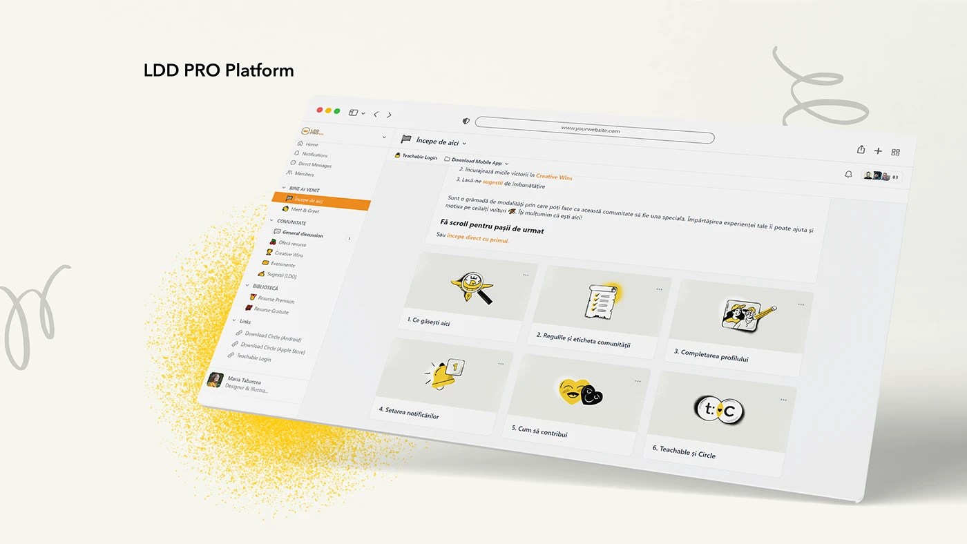
A series of illustrations with a shared visual rhythm and distinct personalities. Seen together, the pieces form a coherent graphic world for Librăria de Design.
Maria’s work doesn’t just complement a brand, it brings it to life. The expressiveness of her illustrations instantly triggers an emotional reaction. Personally, I was never interested in technically correct illustrations that say nothing. It’s a real pleasure to collaborate with her, because I know from the start she’ll deliver something beyond expectations, 101% of the time.
Ștefan AsaftiFounder @ Librăria de Design
Related projects
More ideas, different forms.
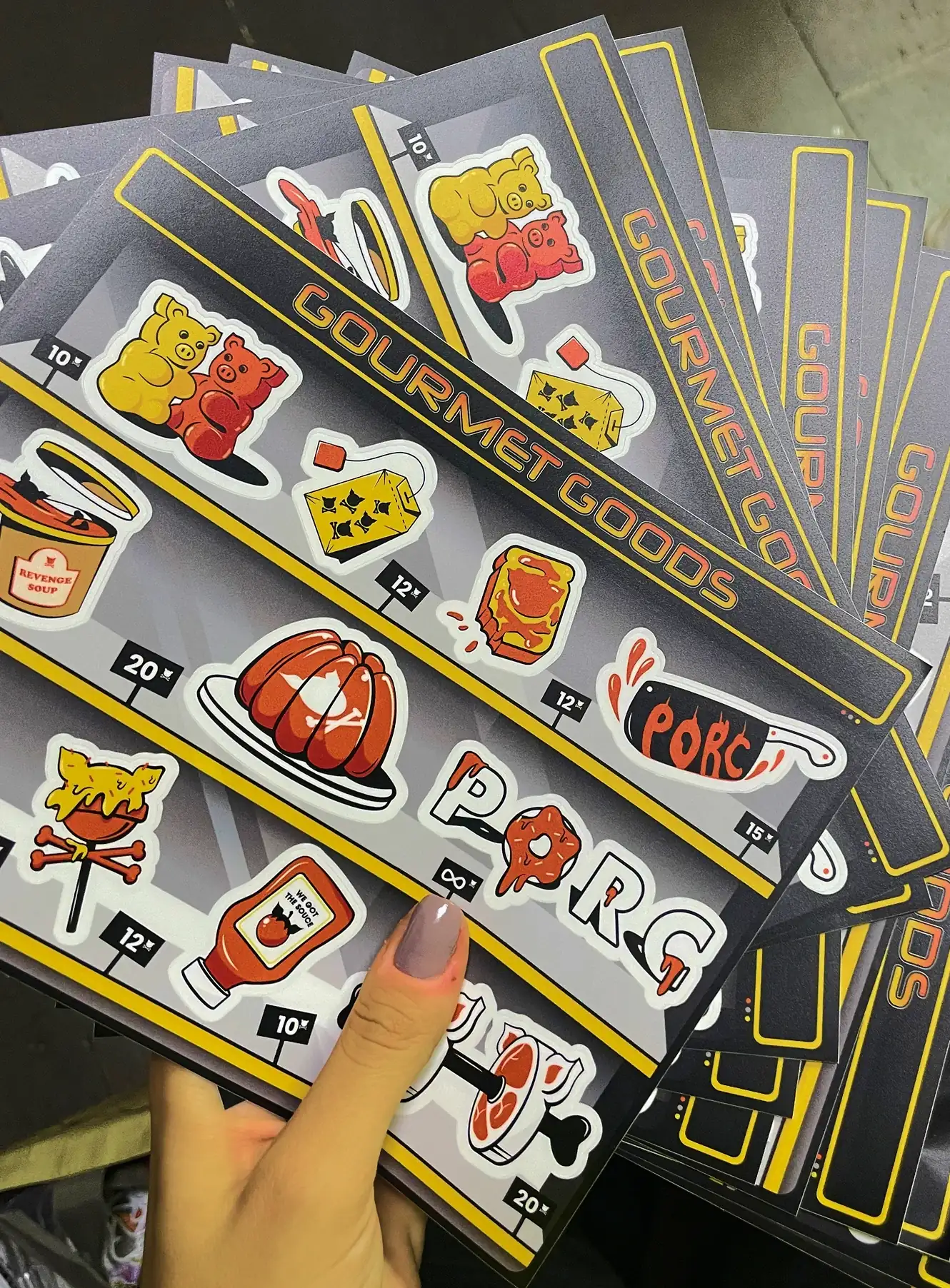
PORC × ARTABARCEA
Illustration / Streetwear
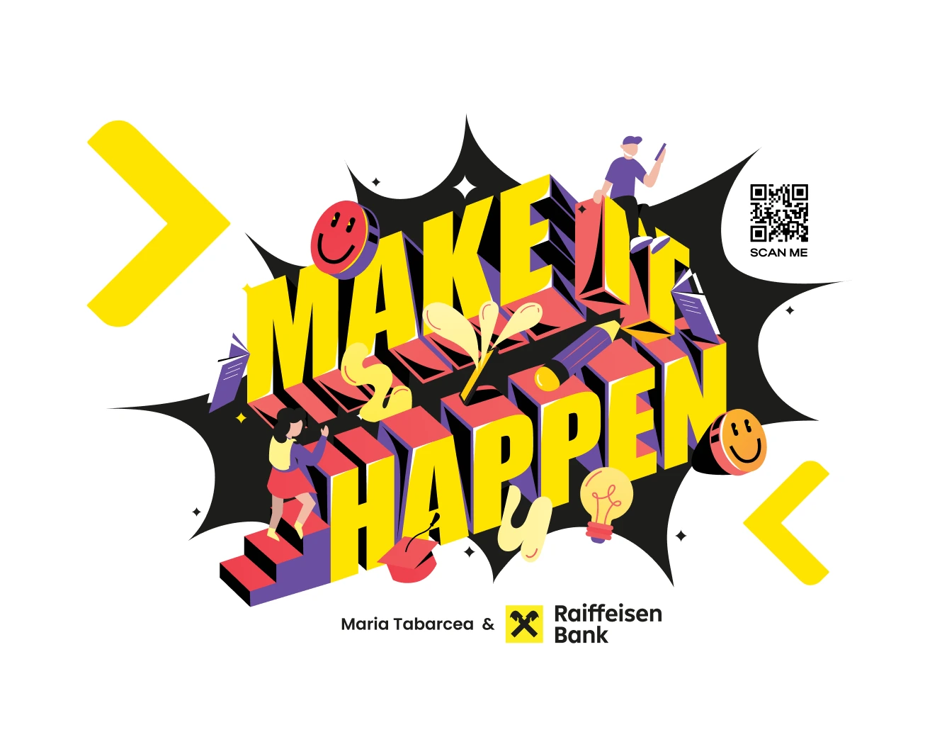
Raiffeisen × Maria Tabarcea
Creative campaign / Illustration
Category:
Date:
February 3, 2026
